.png)
case study
ARKESTRO
LOGO
GUIDELINES


Client
ARKESTRO LOGO
A predictive procurement platform reshaping how procurement drives value, efficiency and resilience.

The brief
Arkestro needed a new logo and a clear set of guidelines to strengthen its identity in the procurement space. The aim was to create a modern, energetic mark that reflected its mission to simplify and amplify procurement processes, supported by comprehensive rules for usage, colour, spacing and application.
Outcome
Rebel delivered a bold identity that finally reflects who Arkestro is becoming. The expanding circle mark and clarity of the guidelines gave us a brand with real momentum.
Arkestro’s Founder and Chief Strategy Officer

The Rebel spirit
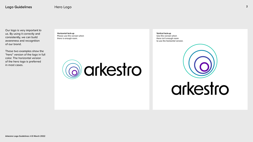
We broke away from the category’s corporate stiffness and built an identity centred on momentum and clarity. The expanding circle icon became a visual metaphor for Arkestro’s amplification and impact. Paired with bold design choices and intuitive guidelines, the identity empowered the brand to show up with confidence, not just as a logo, but as a signal of transformation.

Project overview
Where strategy meets execution
The strategy centred on redefining the category through a bold, momentum‑driven identity that positioned Arkestro’s transformation as its strongest competitive signal.
As part of the logo development, horizontal and vertical versions were created, and the guidelines ensured the logo was robust across extensive digital and print use while remaining future proof.